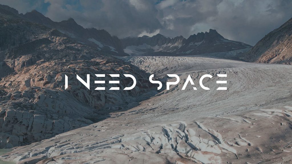
Type is everywhere. No matter where you look you are likely to see some sort of wording. That’s not at all surprising, the written word is one of the main ways we as a species communicate.
But have you ever stopped to really look at the wording? We all know different fonts exist, we’ve all played around with them creating Word documents at school or at work. Have you ever really paid attention to them though?
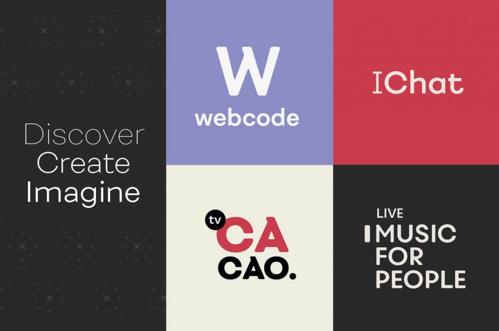
Fonts come in all styles (serif, sans-serif, slab, script) and variations (bold, italics, heavy, rounded). It’s no wonder then that there are thousands upon thousands of fonts out there for you to choose from.
What font you choose is obviously highly specific based on what it’s job is. However, you’re going to pick you font from one of two different libraries: paid for (premium) or free to use.
So which should be choosing? Premium or free?
Free fonts
Free fonts are definitely a tempting option. There seems to be an infinite amount of choice covering every font style imaginable. Just having a quick flick through websites like Font Squirrel, DaFont and the Google Font list you can easily see the variety that there is in this market place.
What’s great about all of the fonts from these websites is not just that they’re free to download and use. It’s the fact they’re free to use commercially. This is a great benefit for many people for a whole host of reasons.
The benefits of free fonts
- Cost (or lack of): This is kind of a no brainer and the clue is in the name. Not having to pay for something can be a real life saver. If you’re just starting out as a freelance designer (as I once was) and you can’t yet afford to buy licences for some premium fonts. Free to use fonts offer you a way of completing designs without breaking the law.
- Simplicity: Because these fonts are free for commercial use, you don’t need to worry about complex licences. Where and when you can use the fonts. How many people can install them. How much traffic your website can have each month. Simply install them, use them, enjoy them.
The negatives of free fonts
- Quality: Like many things in life, you get what you pay for. I’m not saying ALL free fonts are of low quality, some are actually very good. A large majority however are not brilliantly designed, nor are they great to work with. Often letter spacing is way out and uneven, and there are usually a lot of missing symbols and glyphs.
- Lack of varieties: What I love about a great font is the variety you get from a single family. Bold versions, italic versions, rounded versions. All of these can create a different impact when used in a design. Unfortunately, many free fonts simply don’t have different variations. It’s just one stand-alone typeface. This can cause issues when trying to create interest in a design.
- Commonplace: Because high quality free fonts are a rare breed you can often see them used time and time again in different designs around the world. It’s going to be tricky to stand out when everyone else around you has the same type.
Premium fonts
As the name suggests, premium fonts are the higher end of the font market. The price for premium fonts varies hugely, ranging from £10-£20 for a font family up to £1,000’s for some of the more high end premium fonts.
There are numerous places you can buy fonts from including: MyFonts, Fonts.com and FontShop. All these websites have an incredible selection of fonts to choose from. If you’re looking for an amazing deal every once in a while then DesignCuts offer some unbelievable discounts for limited periods of time.
The benefits of premium fonts
- Quality: There is no better benefit to a premium font that the quality of its design. Because of the money premium fonts can earn their designers they have had A LOT of time spent crafting them. They balance perfectly, letter spacing is even and there is usually a whole family of variations and weights to play with. Quality fonts can make a good poster or good logo design and make it great.
- Longevity: When it comes to design, timeless is a great achievement. This is particularly true in logo design and brand identity. Brands need to be iconic and long lasting in order to become ingrained in people’s minds. Well designed fonts like Futura and Gill Sans have been around for nearly 100 years and still look as great in today’s modern designs as they did on their release.
- Choice: One of the negatives of free to use fonts is definitely a benefit of premium fonts. The sheer choice of high quality fonts available to you. The large majority of premium fonts are brilliantly designed, and as such you’re not limited to a handful from each font category. Whatever the situation there will be multiple premium fonts available that will answer the call.
The negatives of premium fonts
- Cost: Premium fonts are fantastic and a great asset to any designer and brand. They can however be quite expensive. The full Futura font family costs £340 for 5 desktop installs. This price then rises to £540 if you want to use the fonts for web use as well. As a young designer or sole trader these prices may be well out of your budget, which is totally understandable.
- Licences: More often than not, buying a premium font isn’t as simple as simply buying it. There are multiple licences to think about stating what you can and can’t use the font for. Unless you’re experienced in this field it can be quite daunting to understand what you’re legally required to do.
*Freemium fonts
There is another section of fonts worth mentioning in this article and they’re the ones that you sometimes buy, and sometimes don’t. Freemium fonts are free to download and use for your own personal projects or school projects for example. But if you want to use them commercially you have to buy a licence for them.
Think of them as a sort of middle ground between free to use and premium fonts. They’re great for students refining their craft as it gives them the opportunity to use higher quality fonts without any expenditure. For new freelancers it gives them the chance to download and use the font in designs and only pay for them if they end up using them in a final product for a client.
Personally I really like freemium fonts and I’ve built up quite the library of them over the years.
Which type of font is best for you?
I’d live to give a direct answer here and say which type of font is right for you. Obviously I can’t do this as it’s so dependant on your own situation. The only thing I can say with some confidence is that if you want design a lasting brand then premium fonts are the way to go. The versatility and quality of premium fonts makes them the go to choice for this.
Outside of that treat each project as an individual and search for the right font for it. It may well turn out to be a free one! Plus, searching for fonts is a hugely enjoyable experience (to me anyway!) so it’s a win win.
Happy hunting!
