Every once in a while a company, no matter how well established, feels a bit of an image refresh is needed. Most of the time these are very welcome changes as companies may have started out with a poor brand identity and logo design, having never had the funds to invest in it at start-up level.
Generally when a company does this it is to simplify their image and update that old complicated logo into something more sleek and 21st century. A perfect example of this is Starbucks.
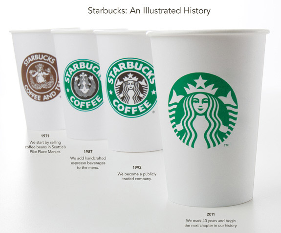
As you can clearly see, with each evolution of the Starbucks logo something is lost…but in doing so more is gained. The essence of the logo is carried forward each time but it also becomes more prominent. Due to the size of Starbucks the symbol is recognized across the globe, as a result the name no longer needs to be included. What’s left is a very minimal, very unique and instantly recognisable mark. Well done Starbucks.
Now, back to the actual point of this article. The latest company to jump aboard this band wagon is eBay. The big difference here, of course, is that eBay is not a company that has been around since the mid 1900’s. Formed during a time when internet companies were launching by the day eBay’s original logo was similar to others of the time, take Google for example.
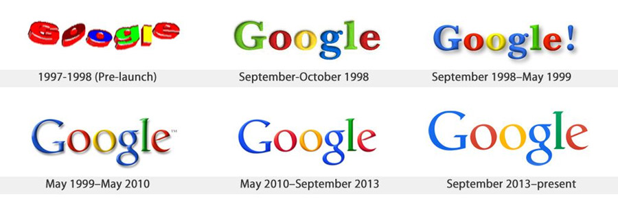
Google too has been busy over the years revamping their logo and company image, and have done so very successfully in my opinion. Rather than have a huge overhaul of their, very 90’s, typographic logo they have chosen to tweak it slightly and let the distinct colour scheme do the work for them. This can be seen in the Chrome logo, Gmail logo and other Google brands. All they did with the logo itself was to tone down the bevel and drop shadow, and make the colours that bit more vibrant.
As with Starbucks I love how the Google brand image has evolved over time and even though the changes to the actual logo have been subtle, overall it’s a great case study of how to evolve a brand. Yes, to all you pedantic folks out there, I’m aware that the ‘original’ logo I’ve used is the 3rd revision but let’s face it, the first 2 were never really in the public eye.
OK, now I will comment on eBay.
Here is the eBay logo we are all familiar with, it’s not one I don’t like or have anything against. In fact, I quite like it. It has character and a certain charm which shows something fun and energetic, everything that using eBay is! (we’ve all been there bidding on something at the last second, nervously waiting to see if we’ve snatched a bargain)
To me it still serves it’s purpose well. It doesn’t look particularly dated and it’s now something so iconic. If you’re going to change it, you need something very, very good.

As we can see, this is far from what’s been achieved. What we instead have here is an incredibly boring, albeit functional, wordmark with some very questionable kerning. I can understand completely where the concept came from, but it’s just not been pulled off at all. Yes it’s more modern and it’s a bit ‘cleaner’ but it’s also too clinical and all of the heart and character of the original. I’m not looking forward to when this gets put into use.

