Following on from yesterday’s article about eBay getting it very wrong with their new logo here’s another example of a young establishment changing it’s brand. This one, however, is a bit more personal to me as the establishment in question is the place where I studied, The University of Lincoln.
Lincoln Uni started life ten years ago, separating from The University of Hull, and has since expanded drastically and constantly been improving year after year, both in facilities, courses, and teaching. This can be seen in the dramatic leap up the university rankings in the past few years. It appears obvious that the uni wants to continue pushing forward having recently had the new Siemans Engineering Hub added to the campus as well as plans for a large state of the art sports facility, these are all great new modern additions.
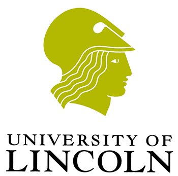
One thing I always found refreshing about the Lincoln uni brand identity was it was unlike the majority of universities, which are very oldy worldy in their design. There’s nothing wrong with this, most of the universities in question have a great history behind them and the emblems represent that. Lincoln, however, does not have hundreds of years of history and as a result I found their original emblem very fitting.

The Minerva logo was something very different compared to most university logos. The meaning behind the logo is great, Lincoln being a Roman settlement the connection to Roman mythology is easy to see and Minerva is definitely very appropriate (she was the virgin goddess of poetry, medicine, wisdom, commerce, weaving and crafts).
Alongside the representation of Minerva, the location of the university campus can be seen in the hair of Minerva. The waves in her hair directly mimic the waves and ripples that can be seen daily on the Brayford Pool, next to the campus.
What’s so great about this logo, compared to most university logos, is the simplicity. It is a flat single colour so can easily be changed for used in monochrome, it’s lack of detail makes it scalable for use in print and screen and the type can be moved to form a horizontal layout.
You might be wondering then ‘Why on Earth would the university see fit to change it?’. I also thought this. As it turns out, the reason is nothing to do with how the logo looks or functions, it instead comes down to trademark laws, and the University of Lincoln cannot copyright the symbol above.
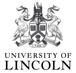
This was a big issue for the university, apparently, and as result they now have this:

As you can see it’s very much the opposite of the old Minerva logo. It is now a very run of the mill, generic, forgettable university crest. Yes it may have some meaning behind all the MANY different elements to it but what good is that if people can’t remember it (or even see what these elements are when scaled to normal sizes). You can read up on some of the rational behind it here: Coat of Arms
I’ve made my opinion on this quite clear and in a recent poll carried out by The Lincolnite I am in the minority. What’s your thoughts on the new Lincoln Uni emblem? Is it a step in the right direction? Or was the Minerva logo more appropriate for the uni? Let me know in the comments below.


