It’s relatively common knowledge that Pentagram are at the very top end when it comes to brand identity design, and this shows in the level of clients they attract. Recently they have completed work for Microsoft by creating the new Windows8 identity.
Pentagrams latest project, headed up by the fantastic Paula Scher, is the rebranding of the worlds leading weight loss programme, Weight Watchers.
The old Weight Watchers logo was nothing spectacular, nor was it anything horrific or offensive to the eye. It did its job and had good brand recognition, through the longevity of the brand.

So there’s the old logo which we all know and have become familiar with over the years of seeing our loved ones and friends, maybe ourselves, try to shed the pounds come the new year.
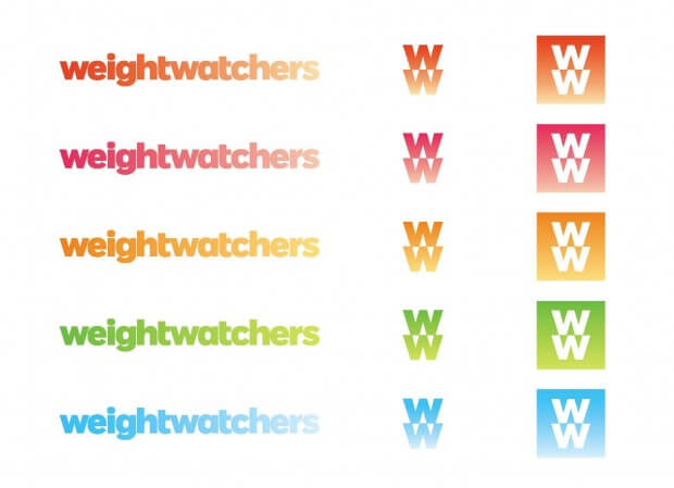
And here is the new typographic logomark developed by Paula Scher:

Now a lot of you may be thinking the same as I did when I first saw this. ‘Oh here we go again. Another lazy ass clean minimal typograhpic logo.’ Not dissimilar from the eBay logo controversy. Well rest assured I do not think this lands in the same boat.
Although on first sight this may seem very uninspired and dull, even a little odd considering weight of the font, remember this is for a company that helps people lose weight.
You can’t really begin to appreciate until you see the logo in use. Only then do you really begin to fall in love with this new look.

When the colour variations are brought into the equations you can see how the gradient in the logo adds an element of softness to what would otherwise be a very strong, masculine wordmark. This also shows the versatility of the new logo used as either an icon or monogram.
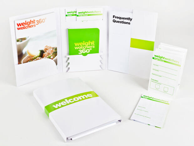
As nice as all this is though it’s the new print material that really makes this brand stand out and make you think ‘Wow, that is gorgeous’.

If I were to receive this welcome pack through the post I wouldn’t be able to stop myself diving in and having a read through. Even though it’s a very simple, clean, and white design there’s something very appealing about the vividness of the colours that just makes you want to look further.
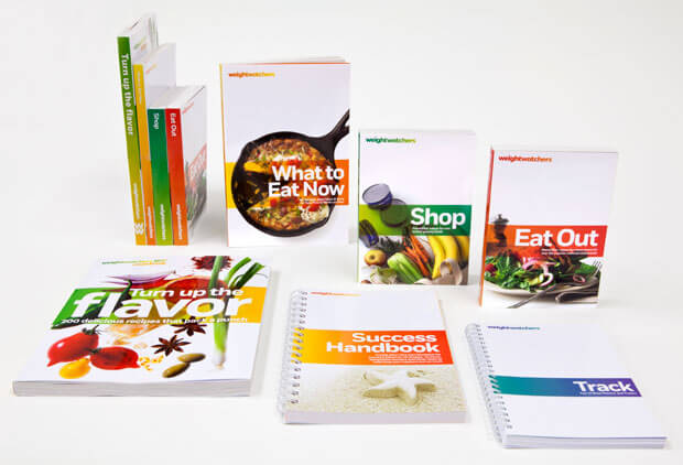
Then there’s the cherry on top of an already lovely piece of work. The new Weight Watchers books. Simply put these are stunning. Again, carrying on from the welcome pack the design on the whole is very white, open and clean which makes the colours look so vibrant and enticing. The pictures jump off of the page and make you want to pick them up. The use of the gradient from the logo reversed and overlayed over the images is a lovely way to tie everything together as a whole.

Overall I’m very impressed with this new identity and it really gives Weight Watchers a new image of being fun and fresh. Which is exactly what you want when trying to lose weight.


